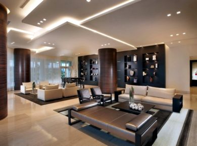
The new canteen designer in the office of the Mirror Magazine was designed by architect studio Ippolito Fleitz Group. The canteen is spread to 520 square meters and has a futuristic design and mirror surfaces. Designers have developed a minimalist style in gray and neutral tones that create with yellow accents in the ceiling a nice contrast.
The designers of the review mirror the canteen with strong optical effect

The designers of the review mirror the canteen was designed so that people can not only mitkriegen the functional aspect, but also visually very impressed. The mirror effect is seen almost any surface. The designers have not focused on the furniture, but the walls, floor and ceiling decoration. The rounded lines and geometric shapes circle amplify the surreal feeling of being in an imaginary place.
Designers in the trendy district of HafenCity Hamburg canteen

The canteen design particularly impressed by the design of the single cap. The ceiling has been set at 4,230 plates in a circular machined aluminum. The circle can be seen in almost every subject – round seats decorative elements for walls and ceiling paneling. An opulent effect also crystal elements hanging from the ceiling, which brings even more originality inside.
The elements in a circular shape for ceiling

Decorative crystal objects for more opulence

Round table with mirror surface

Interior in gray tones

Design round lamp

Modern decor, canteen

Seats in black

Ceiling with unique decoration

The ceiling designer in detail

Curtain in a neutral color

Modern canteen in the office of the mirror

crystal rods suspended from the ceiling


Architecture Studio: Ippolito Fleitz Group
Design Team: Peter Ippolito Fleitz Gunter, Tilla Goldberg, Christian Kirschenmann, Tim Lessmann, Alexander Fehre Christine Ackermann, Roger Gasperlin Katja Heinemann
Photos: Zooey Braun
