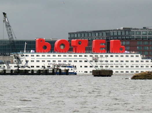
28/08/2015 – The term “Botel” identifies a hotel on a ship. One example is the Botel in Amsterdam, which has undergone a makeover since 2011. The owner’s question was how to improve the Botel’s image so it would harmonize with the dynamism and creativity of the NDSM pier.
Born from this brief, the Botel project by MMX Architects and Dutch architect and filmmaker Jord den Hollander offers a creative and daring answer.
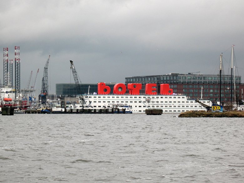
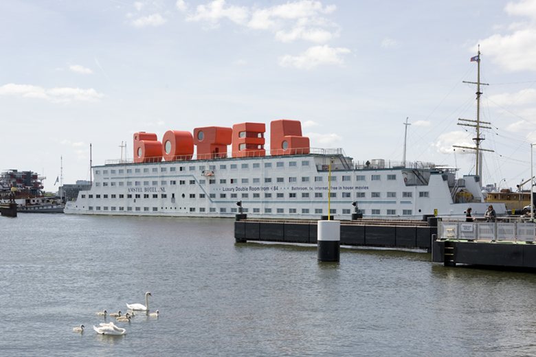
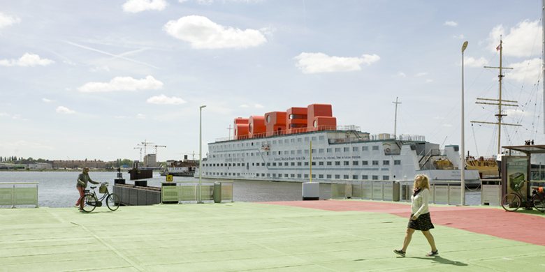
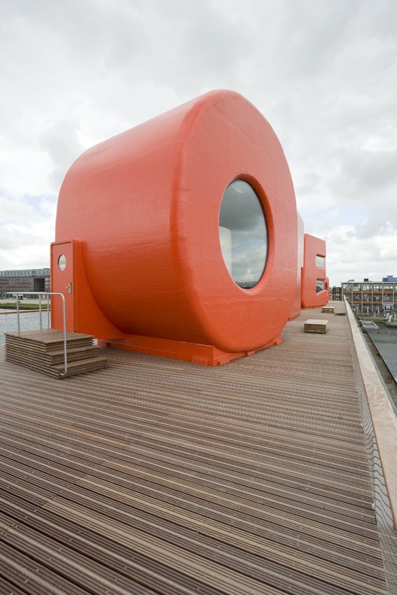
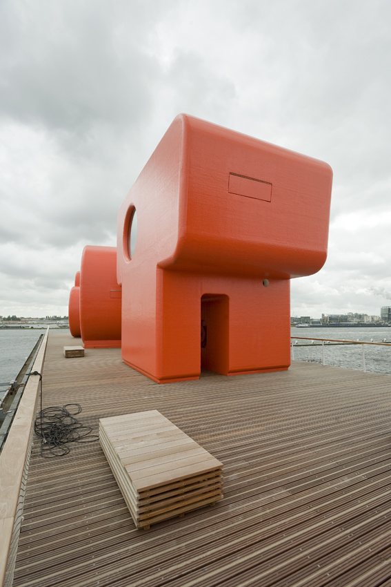
Five huge letters form the word BOTEL. Each letter, 6.5 meters high and fire-red, contains a room and was placed on the upper deck of the ship. The contrast between this crown and the white-and-red ship refers to the ship funnels that once occupied this platform.
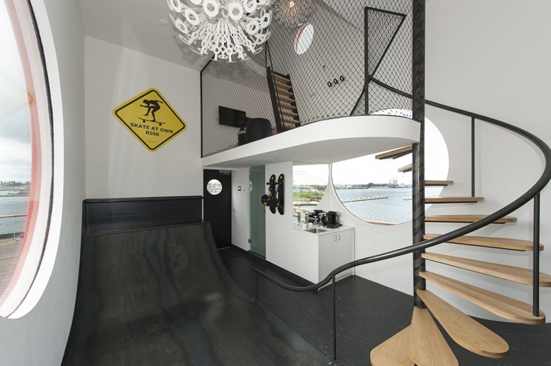
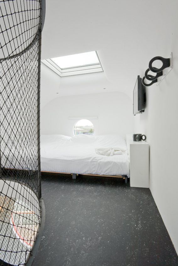
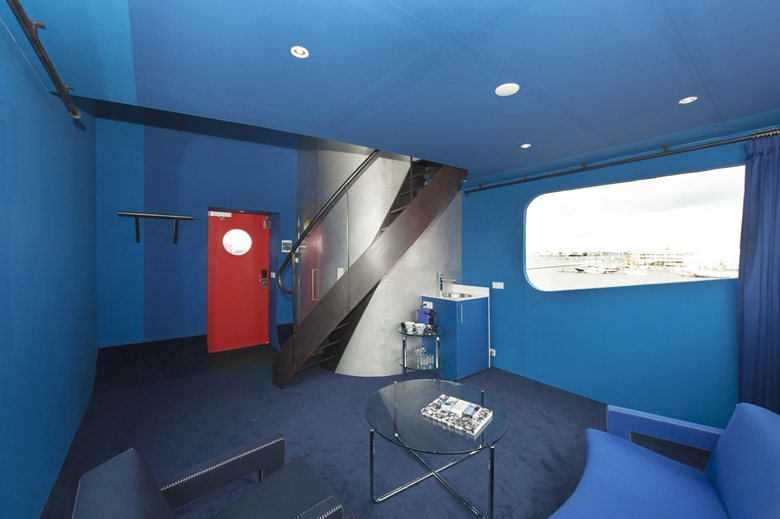
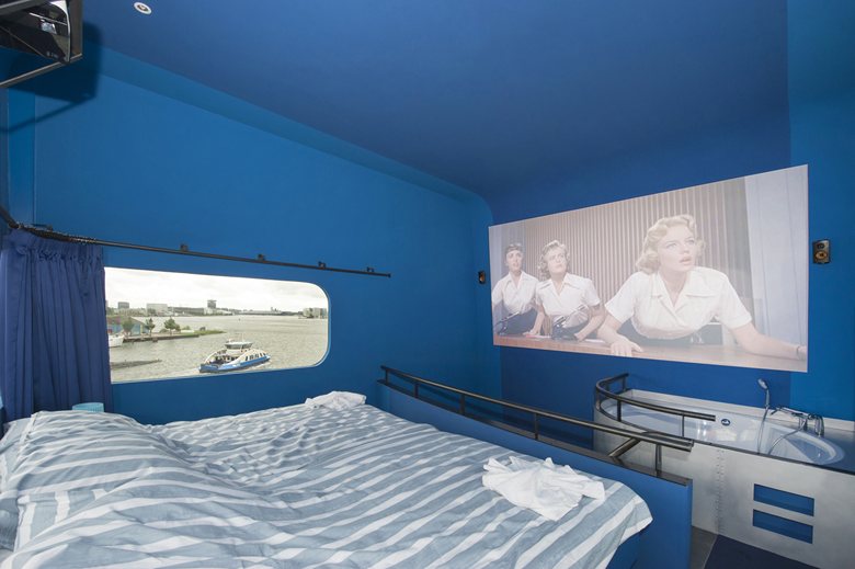
Other designers were involved in the interiors of the letters. Richard Hutten designed a skateboard ramp in the “B”; &Prast&Hooft was inspired by the story of The Wonderful Wizard of Oz for the “O”; architect Moriko Kira turned the “L” into an oasis of peace; Jord den Hollander created the smallest cinema in the Netherlands in the letter “E”; and MMX Architects imagined the top of the “T” as the captain’s quarters of the city.

 Anna Lohan
 Peter Dark